Responsive Web Design

Redesigning the Citi Small Business website
Our objective was to redesign the Citi Small Business (SMB) experience to bring it up to date with responsive web, and a content overhaul to improve lead generation through product education and content.
Agency: Critical Mass
Overview
My Role
UX Architect
Content Inventory & Audit
Card sort
Navigation Testing (Tree Test)
Stakeholder surveys
Competitive audit
Industry Research
Affinity Mapping
Site mapping
White boarding
Wireframes
Skills Used
Time Frame
8 months
Producer
UX Lead
UX Architect
Art Director
Visual Designer
Team
Design Approach
Our design approach for SMB began with Strategy and Research, in order to understand our users, as well as our competitors. We identified our primary users to be Small Business Owners, and secondary users to be the product owners, and bankers who sell these offerings.
The SMB project was broken out into 6 Phases corresponding with each section of product offerings:
Checking
Savings
Loans and Credit
Business Solutions
Industries and Preferred Program
Resources
Stakeholder Surveys
A majority of the content on the SMB website was out of date. Our first step in understanding the current accuracy of the content was sending out simple surveys to the product owners. Our goal was to validate existing content, and build on it. This would also inform our sitemap hierarchy.
We received a few responses, however they did not provide as much insight as we’d like. We decided to move forward with a competitive audit and create a kickoff presentation, to inspire collaboration with product owners.

Competitive Audit
For each phase, we did a competitive audit. How was our competition presenting their products and educating its users about their offerings? Citi’s current experience was outdated, and not providing users a clear path to becoming customers.
One prime example was part of the Business Services section of the site. Many competitors, with a focus on Chase and Bank of America, had much more robust pages for their Merchant Services offering. The audit revealed numerous improvements that could be made to catch up with the competition.
Some of the most obvious and immediate differences included the use of photography, iconography and in-depth product content.
Customer Journey Map
For Savings, Loans and Lending offerings we created journey maps using our identified personas. These journey maps helped the stakeholders better understand our process, and why we were choosing to restructure the sitemap in a more customer-centric way.

Sitemap Restructuring
We also took note of how our competitors organized their offerings, and how Citi organized theirs. Citi’s current SMB experience was convoluted and confusing - with no clear path for the user to find what they need.
Our content audit and a Citi led Card Sort and Tree Test informed us that there was a big opportunity to simplify and streamline the IA. In addition we learned that:
Users want customer-centric terms that they can understand “loans” rather than “lending”
Users used functional language for their groups such as “Banking, Credit Cards, Services, Investing & Loans”
Taking a closeup look at how Business Solutions changed in the redesign illustrates this improvement especially well. Prior to the redesign, Business Solutions were haphazardly clustered on the SMB website, with two separate entry points. These entry points were not consistent, grouping Business Solutions products in different categories on each landing page. Additionally, products such as Global Business Services were left out.
Business Solutions sitemap prior to restructuring: Products are not consistently organized and findability is difficult. Some groups are too overloaded with products. Product and group names are not user-centric.
Business Solutions sitemap after restructuring: Products are organized by importance, with clear distinction between landing pages and child pages. Small cash management products are grouped together.
Wireframing and Design
Our approach to wireframing was to design reusable components and page templates to expedite the development process. We accomplished this by using the established Citi Digital Design Language (DDL) components as well as building several custom new components, that would be unique to the SMB experience. In effect, we were creating a new design-system especially for SMB.
We wanted to minimize the number of overall components, and make sure that each new component was used at least several times throughout the templates.

We held many in person wireframe reviews, where we holistically analyzed how the website was coming together, and how new components were interacting throughout the experience.
We designed all pages to accommodate a mobile breakpoint.
Creating Quality Content
A big part of the redesign was focusing on the content. We wanted to provide users with up-to-date, quality content that would educate them to make the best decisions for their business. The current SMB experience did not have a consistent brand voice unifying it’s products. Additionally, it did not have clear drivers to convert users. We focused on creating concise, user-centered language and content that would encourage action.
We provided the users with educational components, a consistent footer with actionable items, engaging headers and clear CTAs throughout the experience. Since online account opening was not yet an option, our main CTA was to Visit a Branch where a user can speak with a banker directly to open an account.

We created reusable components to help educate the user with quick hits of information. The headers and footers were consistent throughout the experience, creating a brand voice and building trust with the user.
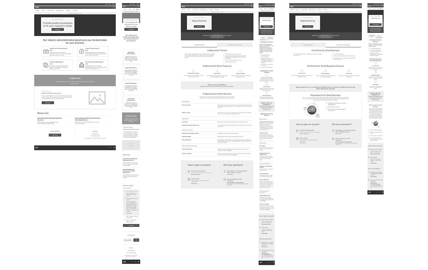
Final Designs
Our biggest win in this project was succeeding to redesign and restructure the entire website into a more customer-focused experience with the site architecture, content, brand voice, and visual design. What come out of this 8+ month project was a completely brand new experience for the SMB customer that will hopefully bring Citi’s feature packed Small Business offerings to the forefront of the industry.

Savings landing page

Savings product detail page
Takeaways
The SMB redesign was a huge undertaking that had many hurdles - working with dozens of product owners who often disagreed with each-other across multiple product offerings, validating old content and creating new content, designing new components and templates, battling legal feedback, and working with developers to hit deadlines for every phase. It gave me valuable experience working with a large amount of stakeholders, and managing various levels of expectations. All in all, I’m happy to have had this experience as the outcome was a cohesively redesigned website for a strong set of small business products.