Product Design, Mobile App
Building an updated design system for the Citi iOS app
Our challenge was to create a Digital Design Language for the Citi app across iOS devices, primarily iPhones. This new Design Language or “DDL” would have to be accessible and meet WCAG AA standards. It also had to be as native as possible–following Apple’s Human Interface Guidelines (HIG)–without stepping too far from Citi’s own Brand guidelines.
Agency: Critical Mass
Overview
My Role
UX Architect
Heuristic Audit
User Research
Component Research
Competitive Analysis
Wireframing
Skills Used
Time Frame
4 months
Producer
UX Lead
Senior UX Architect
UX Architects
Art Director
Designers
Team
Tools
Sketch
The Citi DDL project was heavy on research. I was tasked with researching components as well as patterns. These research documents would culminate into final recommendations, which would be passed to the Design team. The purpose of this project was to create a consistent, shared knowledge base of how components and patterns should be used throughout the Citi iOS ecosystem.
Once a component was finished, we would continue to work on more components until we were able to create a Pattern. Patterns would sometimes further inform us to go back and update our initial component recommendations.
Components I worked on:
Activity Views
Bottom Navigation
Dividers
Empty States
Keyboards
Push Notifications
Page Controls
Sliders
Steppers
Toolbar
Tooltips
Patterns I worked on:
Legal
Onboarding
Search & Filter
Settings
Research and Recommendations
Establishing Parity
We often referenced our DDL work for Android. Since the Android language was already established, we were aware of a lot of the client’s preferences, and what components and patterns the app required. While there are many fundamental native differences between iOS and Material Design, we wanted to make sure there was as much parity as possible between our components and patterns.
Documentation of Recommendations
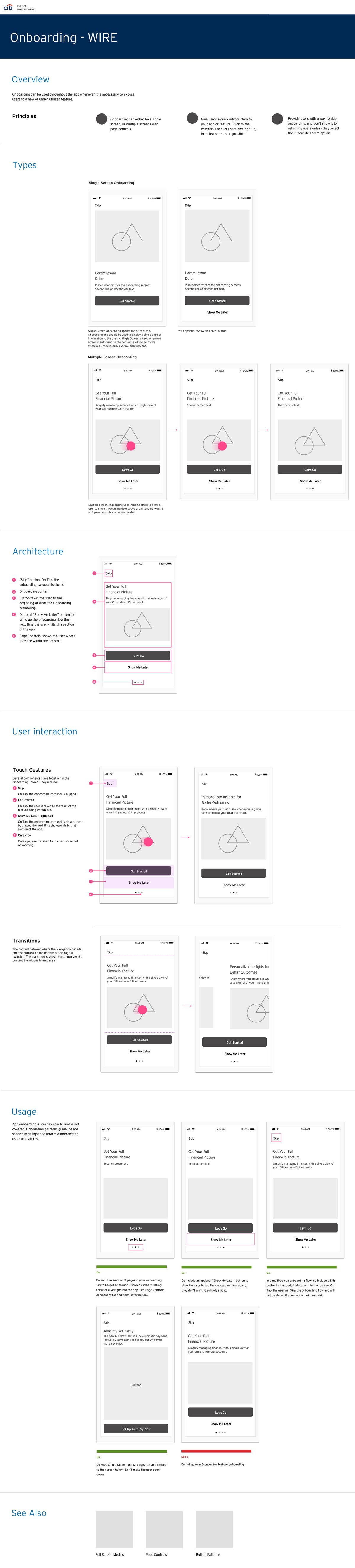
Each component and pattern required thorough UX research and documentation prior to passing over to design. Below is an example of a final recommendation for the Onboarding pattern.
Takeaways
This project was a unique opportunity to be part of a significant redesign of the Citi mobile app. It gave me hands-on and in-depth experience with Apple’s Human Design Guidelines, as well as WCAG. It was also great to be part of a large team of UX designers all working on separate components and patterns that interact together to create a cohesive system. This project gave me a strong foundation for understanding how design systems come together, as well as how to design for accessibility guidelines.