Responsive Web
Designing a rebranded, responsive website for CBS Sports Network
Following the rebranding of CBS Sports and its affiliates, the CBS Sports Network website was in need of a responsive and modern redesign. Our biggest task was making it easy for users to find the CBS Sports Network channel through their cable provider in their region.
Overview
My Role
UX and Visual Designer
Competitive Research
User Research
Sketching
Wireframing
Visual Design
Branding
Skills Used
Time Frame
3 months
Enhancing the User Experience
In addition to updating the look and feel of the website, our challenge was to streamline the content, improve the visitor bounce rate, and find a more effective way to incorporate the channel finder.
Our goals for the new design were:
Streamline the website by focusing on the user's interests and needs, rather than indexing everything the network has to offer
Drive tune-in by emphasizing and raising awareness of the Channel Finder feature
We also wanted keep users engaged by encouraging them to view content and learn more about CBS Sports Network shows and live sports coverage.
Analysis
The old website did little to engage the viewer or provide content that would keep them interested. Additionally, it was not responsive. Following the rebrand of CBS Sports, we wanted the new website to look similarly modular and flat. It should also be consistent with CBSSports.com, which drives traffic to CBS Sports Network through the "Watch" link.
After meeting with marketing, we received a report about the analytics of the website and user flows. Key points included:
600,000 page views / 300,000 unique views a month - most of these are during prime tune in times, on the weekends, and go directly to the Channel Finder
High bounce rate from the homepage, with most traffic going to the Channel Finder page and then immediately leaving
Low percentage of people are visiting section or sport pages
User patterns are pretty stable, most people spend little time on the website and go directly to Channel Finder
With these analytics in mind combined the marketing goal of driving tune-in and raising awareness to the channel, we proceeded to research competitors.
Competitive Research
We began by conducting research and examining comparable websites for inspiration. We looked at a mix of editorial and television network websites. We also looked at all the different ways these websites incorporated video into their design.
We also looked at CBSSports.com - the online arm of CBS Sports. To maintain brand consistency, our goal was to make CBS Sports Network look stylistically in line with CBSSports.com.

Examples of comparable websites
Row One: Content Organization, Modal Windows, Long scrolling pages, Modular design
Row Two: Full Play auto-play looped background videos
Row Three: Form examples for the Channel Finder - slide out form, floating pop-up form

Schedule design examples
Row One: Abbreviated example of schedule on homepage
Row Two: Full page weekly schedule
With our marketing goals in mind, our competitive research led us to the following conclusions:
Video should be emphasized, possibly being the first thing the user sees when the website loads
Section pages for shows should be eliminated and instead focus on a single, long scrolling and mobile friendly site
Heavier focus on imagery and photography over lengthy copy - a quick "eye candy" for users quickly scrolling through
Since Channel Finder is the most popular and searched for page by users, it should be easily available on every page
Email signup for the newsletter should be more easily accessible
The schedule should be revamped to a more minimal day-by-day system, rather than the old, large and out-dated block
Additionally, we knew coming out of the gate that we would have to design different modules for every type of post we planned to have on the new website. We created a list of these modules including:
Video Player
Photo (Single photo, two photos)
Headline/Text Only
Small Photo with Headline/Text
Channel Finder
Email Signup
Schedule

Video module as a full background video splash page

Full-width video module which pulls down and overlays the page
Above: Options with full background video Below: Option with video and abbreviated schedule overlay

Parallax option, video and scrolling schedule option, top nav and channel finder closeup
Wireframes
After discussing sketches, we created low-fidelity wireframes for each module, which we then discussed with the developer, until we finally narrowed it down to the most viable option both for our budget, server capabilities and overall project goal.
Most important and central to our project goal, we focused on incorporating the Channel Finder into the site, making it immediately and easily accessible to visitors without requiring them to leave the page. We wanted users would be able to browse the website and check for their local channel at any time, in theory lowering the bounce-rate and retaining visitors to browse website content.

Design Decisions
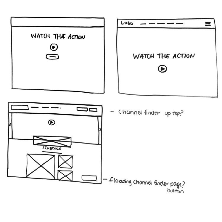
Throughout the wireframes, we tried to incorporate several of the elements we found from the research. For instance, a Channel Finder could be fixed to the top nav and slide out like a form from the right hand side, as in (3). It could also be a hovering button that is fixed to the bottom of the page, as in (2). Both of these solutions do not require the user to leave the page, and are fixed elements throughout the website.
For the schedule, I tried out a couple solutions where an abbreviated version would appear on the homepage. I thought about creating an hourly on air in (1), or a "Now, Next, Later" version as in (2) that wouldn't be a little more loose and only focus on network highlights.
Overall, we wanted the design of the website to be modular and customizable, yet not overwhelming in the way CBSSports.com can be, or USA Today from which we took design inspiration. We wanted each modular block to be visually engaging, focusing on the imagery and key information rather than heavy copy - a design aspect the AMC website does very well.
Revised Wireframes
We continued working on the wireframes, taking feedback, and combining our best ideas. We arrived at the solutions below,

Round 1 Revised Wireframes

Round 2 Revised Wireframes
High-Fidelity Wireframes
We delivered the wireframes to the developer and as the each module was being developed, we worked on high-fidelity wireframes and determining the overall style of the website.
I was responsible for designing the schedule and editorial modules for mobile, featured below.

Photo, Editorial and Schedule Modules for Mobile
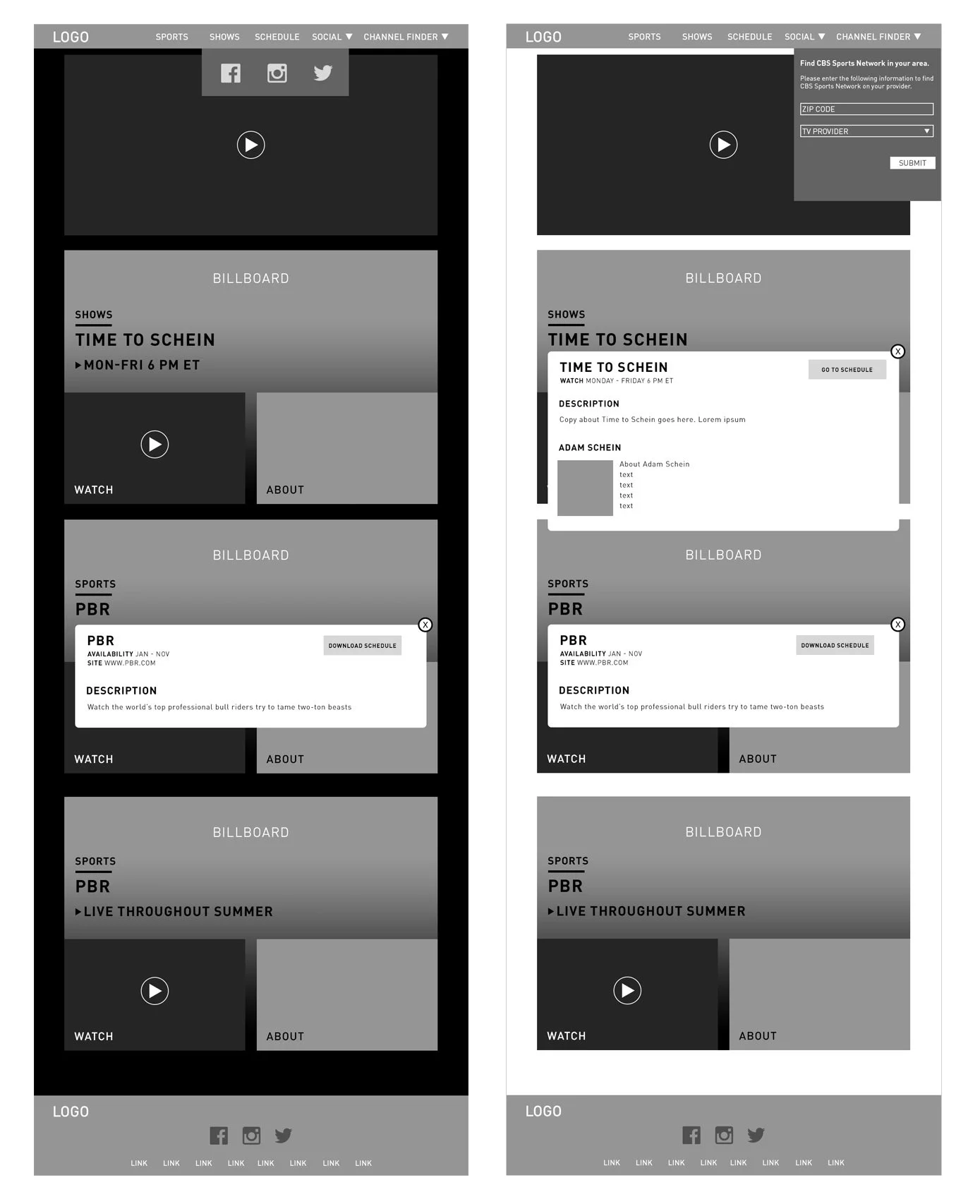
Channel Finder Solution
Designing for the Channel Finder was a big part of this project, and what I was involved the most with. Not only did we need a fixed way to access the channel finder on any page, we also needed a dedicated page that could combine live video authentication as well as finding the channel on your local subscription.
We approached the design for the channel finder/authentication page starting with the sketches to the right.
Ultimately, the design for the channel finder was solved in the following ways:
Fixed top nav with a zip code search with dropdown
Repeating the module throughout the website on the mobile and desktop versions
Dedicated page including an authentication option to view live video


Channel Finder Visual Design on Desktop and Mobile

Channel Finder Landing Page with Changing Background
User Testing and Final Designs
Some issues we ran into during user testing were:
Users were mistaking the "Watch Now" language on videos with a live stream of the show. This was changed to a classic Play button
The difference between videos and images wasn't inherently clear, so we had to emphasize the Play button more
Users were mistaking the blue text on the Schedule for links - since that color blue is also used for links on the rest of the site
Email signup was moved from the footer of the website to the menu-bar, so users could find it easier
The Channel Finder wasn't present enough, should appear throughout the long-scroll more often
Below is the current version of the desktop website and a scrolling mobile mockup, with these changes implemented. Following the launch of the website, we continue to tweak and update it everyday in an ongoing effort to streamline the user experience.


Takeaways
This was my first UX design project that I got to participate in start to finish. It was a valuable experience as I got to see the process through as both the UX and visual designer. It helped that our goal for the website was very clear from the start: to drive tune-in. This goal allowed us to focus directly on the most important aspects of the website, such as the channel finder module and channel finder landing page. It taught me to always keep in mind the important KPIs in a project as a means of driving the design.